
seasonal color analysis
Seasonal Color Analysis
By the StyleCard Team · Last updated July 3, 2026
Learn how seasonal color analysis works, compare the 12 color seasons, and find the Spring, Summer, Autumn, or Winter palette guide that fits your features.
Short answer
Seasonal color analysis compares hue, value, and chroma. In plain terms: warm or cool, light or deep, soft or bright. The 12-season system then maps those traits into Spring, Summer, Autumn, Winter, and their sub-seasons.
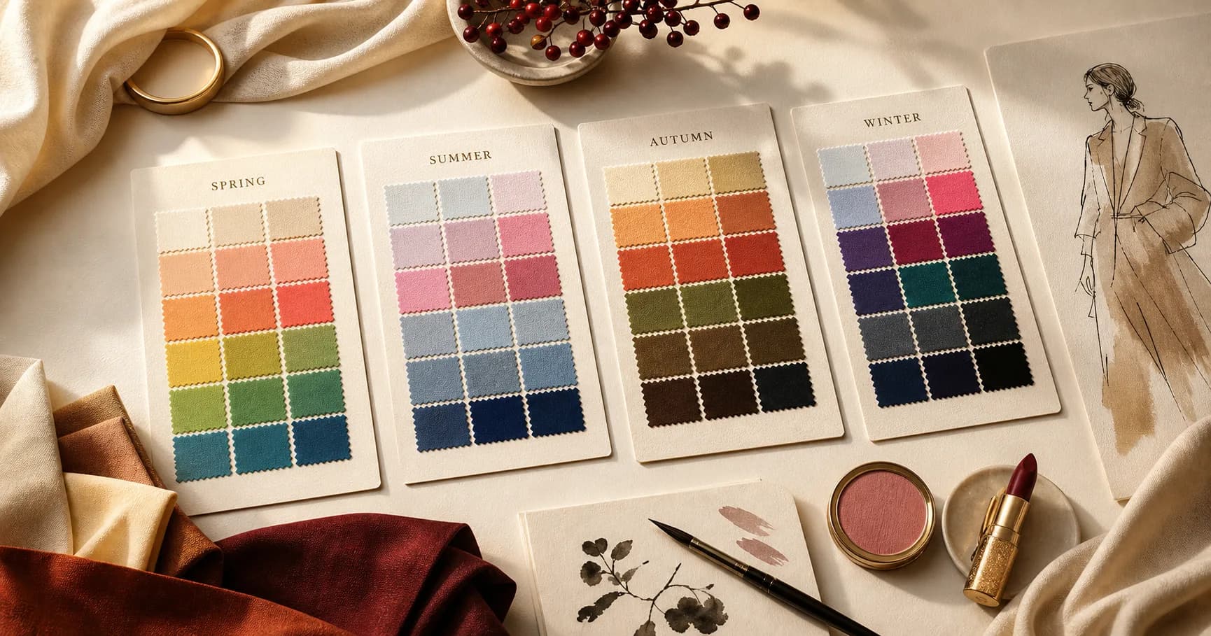
Seasonal color analysis groups your best colors by the way they relate to your natural coloring. The old four-season version uses spring, summer, autumn, and winter. The 12-season version keeps those families but adds more useful detail.
The point is not to box you in. It is to find colors that make your face look clearer, more even, and less tired, then turn that direction into clothes, makeup, and hair decisions you can actually use.
Four seasons vs 12 seasons
The four-season system is simple: spring and autumn are warmer, summer and winter are cooler. Spring and summer tend to sit lighter; autumn and winter tend to sit deeper. That gives you a starting point, but it misses people who sit between the obvious corners.
The 12-season system adds a second trait to each family. Summer can be light, true, or soft. Autumn can be soft, true, or deep. Winter can be true, bright, or deep. Spring can be light, true, or bright. The names vary by consultant and UK sources may call this seasonal colour analysis, but the idea is the same: your dominant color trait matters.
Use the four-season system when you need a fast orientation. Use the 12-season system when you want to shop, choose makeup, or plan hair color with fewer false starts.
- Hue: whether your best colors lean warm, cool, or neutral.
- Value: whether lighter, medium, or deeper colors suit you best.
- Chroma: whether clear bright colors or muted colors look more natural.
Why people mistype themselves
Most self-typing mistakes happen because one clue gets too much weight. Dark hair does not automatically mean winter. Fair skin does not automatically mean summer. Gold jewelry looking nice does not prove autumn.
Lighting, dyed hair, makeup, camera settings, and personal taste all get in the way. Many people also sit close to a sister season, which means two palettes may partly work while only one feels natural.
Skin depth should never be used as a shortcut. Deeper skin does not automatically mean deep winter or deep autumn, and fair skin does not automatically mean light spring or summer.
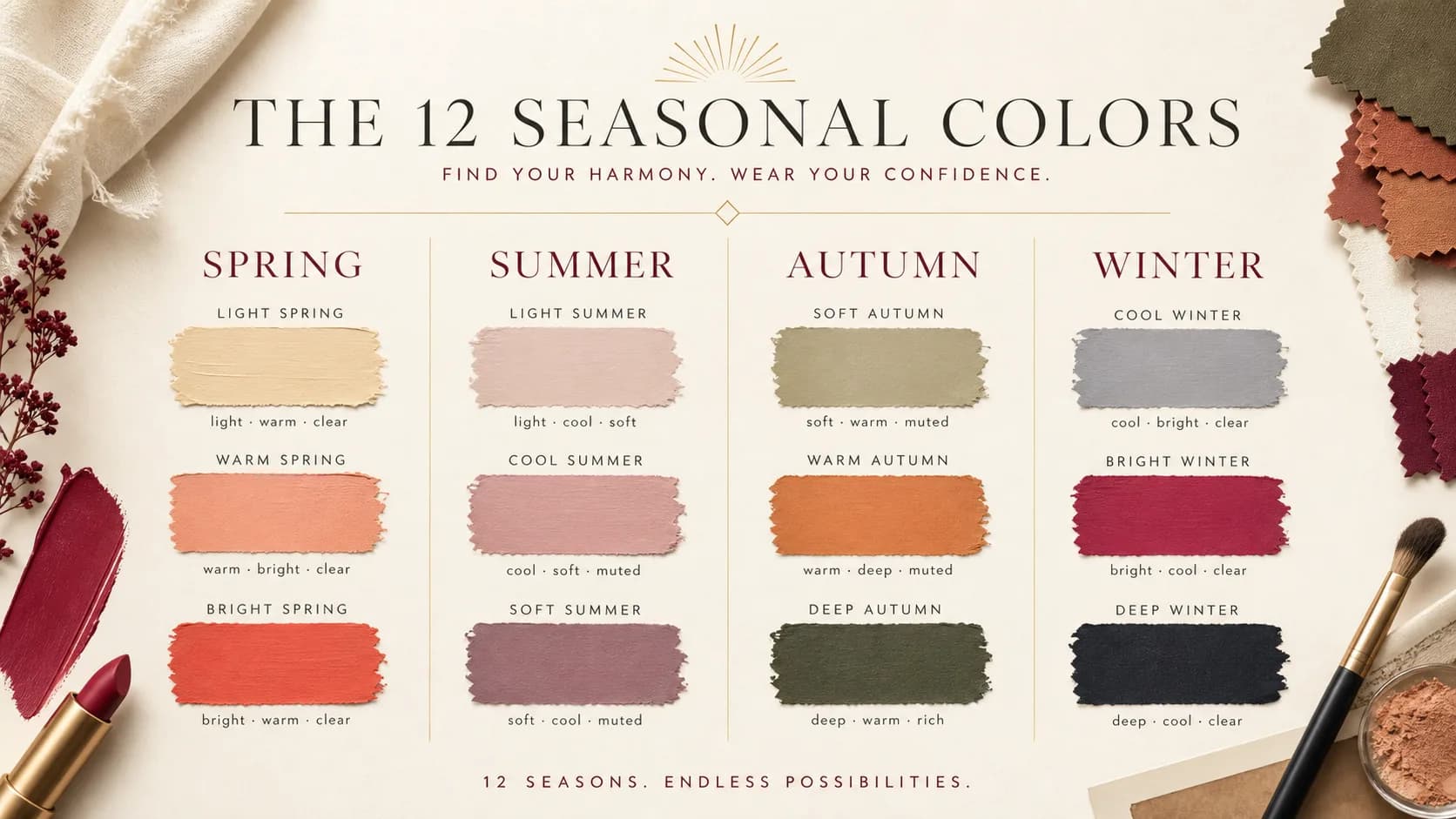
The 12 color seasons at a glance
A good 12-season result explains both your family and your dominant trait. A light season needs colors that stay airy. A deep season needs richer value. A warm or cool season is driven first by temperature. A soft season needs muted color. A bright season needs clarity.
This is why two people can both be Summer and still need different shopping rules. Light Summer needs soft, airy coolness. Cool Summer needs blue-based refinement. Soft Summer needs the most muted version of the Summer palette.
- Spring: Light Spring, Warm Spring, Bright Spring.
- Summer: Light Summer, Cool Summer or True Summer, Soft Summer.
- Autumn: Soft Autumn, Warm Autumn or True Autumn, Deep Autumn or Dark Autumn.
- Winter: Bright Winter, Cool Winter or True Winter, Deep Winter or Dark Winter.
Spring seasons
Spring palettes are warm and lit from within. They usually need color that feels fresh rather than dusty: cream over optic white, coral over burgundy, clear green over olive, and warm gold over icy silver.
Start with the spring color palette if you know you are warm and clearer than Autumn. Then compare the sub-seasons: light spring color palette for airy warmth, warm spring color palette for golden warmth, and bright spring color palette for the clearest spring colors.
- Light Spring: warm-neutral, light, fresh, and lower contrast.
- Warm Spring: golden first, clear enough to avoid earthiness.
- Bright Spring: warm-bright, vivid, and closest to Bright Winter.
Summer seasons
Summer palettes are cool and softened. They are not tropical summer colors. They are misty blue, dusty rose, lavender gray, seafoam, soft navy, and cool taupe.
Use the summer color palette as the hub, then compare light summer color palette, cool summer color palette, soft summer color palette, and the bright summer color palette explainer if you keep seeing that non-standard label in search results.
- Light Summer: the airiest Summer, nearest Light Spring.
- Cool Summer or True Summer: cool first, refined, blue-based.
- Soft Summer: muted first, nearest Soft Autumn.
- Bright Summer: a search term to handle carefully, because standard 12-season systems usually do not include it.
Autumn seasons
Autumn palettes are warm, muted, and earthy. The colors tend to have more golden, brown, olive, rust, camel, copper, or terracotta in them than Spring does.
Start with the autumn color palette, then compare soft autumn color palette, warm autumn color palette, and deep autumn color palette. The labels true autumn and dark autumn are common aliases, so do not let naming differences derail the comparison.
- Soft Autumn: muted first, warm-neutral, closest to Soft Summer.
- Warm Autumn or True Autumn: golden warmth is the main trait.
- Deep Autumn or Dark Autumn: warm depth, nearest Deep Winter.
Winter seasons
Winter palettes are cool, clear, and higher contrast. Winter is where black, optic white, cobalt, fuchsia, emerald, blue-red, and icy pink are more likely to work near the face.
Use the winter color palette hub first, then compare bright winter color palette, cool winter color palette, and deep winter color palette. Bright Winter sits nearest Spring, Cool Winter is the purest cool winter, and Deep Winter sits nearest Autumn.
- Bright Winter: cool-neutral, vivid, and high contrast.
- Cool Winter or True Winter: cool first, clear, icy, and jewel-toned.
- Deep Winter or Dark Winter: deepest winter value with cool clarity.
How to use seasonal analysis without overthinking it
Start by testing color families near your face. If cool rose, slate blue, and lavender gray look calm, summer may be close. If camel, olive, and muted rust look easy, autumn is worth checking. If black, white, and jewel tones look clean, winter may be right. If coral, cream, and clear green make you look awake, spring may be closer.
Then look at what happens when you push the palette. Too bright can make soft features disappear. Too muted can make bright features look dull. Too warm can make cool skin look yellow. Too cool can make warm skin look flat.
Treat quizzes, ChatGPT prompts, and app scans as evidence, not a final identity. The strongest result survives real-life checks: daylight, no heavy makeup, similar fabric held near the face, and a few wardrobe or lipstick tests.
Season matrix: hue, value, chroma, and contrast
A seasonal color palette is easier to understand when you separate the four axes. Hue is warm versus cool. Value is light versus deep. Chroma is clear versus muted. Contrast is how much light-dark separation your face can carry before the clothes overpower you.
Spring is warm and clear, usually light to medium in value. Summer is cool and soft, usually low to medium contrast. Autumn is warm and muted, usually medium to deep and earthy. Winter is cool and clear, usually higher contrast with the strongest dark-light separation.
- Spring: warm hue, light-to-medium value, clear chroma, low-to-medium contrast except Bright Spring.
- Summer: cool hue, light-to-medium value, soft chroma, low-to-medium contrast.
- Autumn: warm hue, medium-to-deep value, muted chroma, low-to-medium contrast except Deep Autumn.
- Winter: cool or neutral-cool hue, medium-to-deep value with icy lights, clear chroma, high contrast.
- Border seasons borrow one trait from a neighbor, which is why Bright Spring can wear more contrast and Soft Autumn can wear gentler muted color.
Decision flow for finding your season
Start with temperature only after controlling the setup. Use indirect daylight, a neutral top, no heavy makeup, and hair pulled back if it is dyed. Compare cream with optic white, camel with charcoal, coral with blue-pink, and olive with pine. Do not decide from one color; look for a repeated pattern.
Next test chroma. Hold clear turquoise, fuchsia, and cobalt against dusty rose, sage, mauve, and soft navy. If clear colors make your face look focused, look at Spring or Winter. If muted colors make your skin look calmer, look at Summer or Autumn.
Finally test value and contrast. If pale colors disappear but deep colors balance you, explore Deep Autumn or Deep Winter. If dark colors look heavy and light colors lift you, explore Light Spring or Light Summer. If medium colors are easiest, compare the true and soft sub-seasons.
- Warm plus clear points toward Spring; warm plus muted points toward Autumn.
- Cool plus muted points toward Summer; cool plus clear points toward Winter.
- If both warm and cool partly work, compare chroma and contrast before choosing a neutral border season.
- If every quick test conflicts, use photo validation or professional draping instead of forcing a label.
Seasonal Color Analysis evidence checklist
Seasonal Color Analysis should be judged by repeated evidence, not by one attractive swatch, one selfie, or one quiz answer. The strongest signal is consistency: the same color direction should make the face look clearer in daylight, make makeup easier, and make outfits feel more coherent.
Use this page with related guides such as summer color palette, winter color palette, spring color palette, autumn color palette. Cross-linking the evidence matters because color analysis is not just one category. A palette affects wardrobe neutrals, lipstick, hair color, metals, denim, and how much contrast an outfit can carry near the face.
For this topic, start with the practical test that matches the search intent: compare methods, check privacy and photo quality, then verify the result with real clothing, lipstick, jewelry, or consultant questions.
- Run the test in indirect daylight rather than warm bathroom light or golden hour.
- Remove strong lipstick, bronzer, filters, and saturated clothing when judging undertone.
- Compare neighboring possibilities directly instead of asking whether one label feels perfect.
- Keep notes on skin clarity, eye brightness, shadow, redness, and whether the color or your face gets attention.
- Use StyleCard as a photo-based preview, then keep only the guidance that survives real-world checks.
Seasonal Color Analysis practical next steps
After reading a guide like this, the next step should be small and testable. Do not replace a wardrobe, book a major salon change, or buy several products because one label sounded right. Start with one near-face color, one neutral, one metal, and one makeup cue.
If you are comparing tools, begin with the lowest-risk method that gives useful evidence. A free preview or quiz can narrow the field; a kit or consultant can resolve close calls; a paid report is most useful when it adds practical shopping, makeup, hair, and outfit guidance.
The most trustworthy result is flexible but not vague. It should say what to try, what to avoid, why the result might be uncertain, and how to confirm it. That is especially important for olive undertones, neutral coloring, deeper skin, dyed hair, gray hair, very muted palettes, and high-contrast palettes. If a recommendation cannot explain the tradeoff it is making, test again before spending money. A result should make repeat decisions easier, not just add a label.
- First purchase to test: one top, scarf, or lipstick in the likely palette.
- First closet move: move best colors near the face and weaker colors below the waist.
- First beauty move: test blush or lipstick before changing foundation or hair.
- First hair move: ask for a gloss, toner, or small shift before a dramatic multi-level change.
- First verification move: retake a clean photo and compare the result against real fabric.
- Final check: the guidance should improve at least three real choices, such as a neutral, a lip color, and a face-framing outfit.
Where StyleCard fits
StyleCard uses a selfie and short quiz to turn color analysis into a practical style card. The free preview gives you a direction before you pay. The full pack adds outfit, makeup, hair, and overview cards so the result is easier to apply.
Use the seasonal pages as a guide, then verify with your own photo. The safest result is the one that works on your actual face instead of only matching a color wheel.
Try it on your photo
Check your season with a photo
Upload a natural-light selfie and get a free StyleCard preview before you buy a full report.
Check your season with a photoRelated StyleCard guides
FAQ
- What are the 12 color seasons?
- The 12-season system splits spring, summer, autumn, and winter into three more specific palettes each, usually based on whether your dominant trait is light, deep, warm, cool, soft, or bright.
- What is seasonal color analysis?
- Seasonal color analysis is a styling method that groups your best colors by hue, value, and chroma so you can choose clothing, makeup, hair color, and accessories that harmonize with your natural coloring.
- How do I know my color season?
- Start by comparing warm vs cool, light vs deep, and soft vs bright colors near your face in daylight. A quiz or photo-based preview can narrow the direction, but the best result should hold up when you test real clothes and makeup.
- Can any skin tone be any season?
- Yes. Seasonal color analysis is about undertone, contrast, depth, and chroma together. It should not assume that deeper skin always means autumn or winter, or that fair skin always means spring or summer.
- Can your season change?
- Your natural coloring usually stays in the same broad range, but hair color, tanning, gray hair, makeup, and personal style can change which colors feel easiest.
Sources
About the StyleCard Team
Our guides are written using established color analysis frameworks — including the seasonal color system and Munsell color theory — reviewed against practitioner and academic sources, and updated when research or product changes warrant a revision. See the Sources section above for the references used in this article.