
warm spring color palette
Warm Spring Color Palette
By the StyleCard Team · Last updated June 27, 2026
See warm spring colors, makeup cues, hair direction, and outfit ideas, plus how warm spring differs from true autumn and light spring.
Short answer
Warm spring — also called true spring — is the most purely warm spring palette: medium-light, medium contrast, and at its best in fresh clear colors with a yellow base.
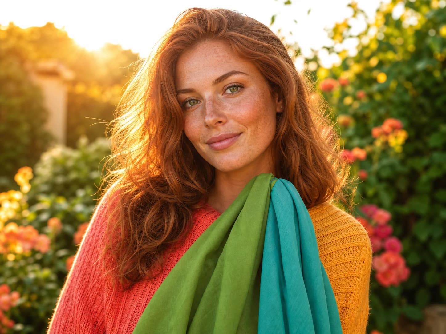
The warm spring color palette is sunny, saturated, and fresh. It is the truest expression of the spring family: warm first and bright second. Pure warmth and a lively glow are what make it work.
Think mango, papaya, turquoise, leaf green, guava, camel, and golden khaki. Dusty autumn browns, muted berries, cool mauves, and matte heavy makeup tend to flatten the palette rather than lift it.
Warm spring palette traits
Warm spring — or true spring — is the warmest of the three spring palettes. The face needs glow and some saturation, not powder or dustiness. Good colors look like they have sunlight built in: mango, papaya, turquoise, golden khaki, leaf green, and warm coral.
The easiest neutrals are caramel, camel, golden khaki, pecan, and beige. Pure black and icy grey can make the face look flat quickly. When a dark anchor is needed, a deep warm brown or warm navy usually works better.
Warm spring vs true autumn
Warm spring and warm autumn share the same warm undertone, which makes them easy to confuse. The key difference is freshness and saturation. Warm spring needs lively, clear colors with energy. Warm autumn needs softer, earthier, more muted tones.
A quick test: compare a fresh coral against a muted rust-brown. If the lively coral makes you look healthy and the muted rust dulls the face, warm spring is closer. If the rust settles in and the coral feels a little loud, warm autumn may be the better fit.
Palette preview
Colors to test near your face
- Undertone
- Warm to neutral-warm
- Chroma
- Bright and clear
- Value
- Medium-light
- Contrast
- Medium
Best colors
Mango
#FFBF01
Papaya
#EAA222
Guava
#FB7273
Cucumber green
#7BB369
Leaf green
#4CBB16
Turquoise
#01B6EB
Cobalt-leaning blue
#1460BD
Neutrals
Golden khaki
#C3B181
Caramel
#B59462
Camel
#D4AC8A
Pecan
#865F45
Peanut-butter brown
#AA7243
Makeup cues
Watermelon
#EC5578
Peach
#FEA177
Use carefully
Pure black
#000000
Outfit starting points
- Camel trousers, turquoise blouse, coral lip.
- Golden-khaki shirt dress, papaya sandal, warm gold hoops.
- Cucumber knit, mango bag, neutral caramel denim.
- Warm beige base, watermelon accent, cobalt shoe.
Makeup and hair direction
Warm spring makeup works best in radiant or dewy finishes: peach-based blush with light shimmer, medium-intensity orange-coral or warm pink lips, and cream or warm taupe eyeshadow. Matte heavy foundation, black liner, muted berry lips, and autumn-rich bronzer can all fight the freshness the palette needs.
Hair stays most natural in golden blonde, copper, warm auburn, honey or golden brown, and warm highlights. Ashy tones, mushroom brown, and blue-black can pull the complexion away from its naturally warm glow.
Warm Spring Color Palette clothing checkpoints
Warm Spring Color Palette works best when clothing follows the same undertone, value, chroma, and contrast as the palette. Start with the reliable anchors: Golden khaki, Caramel, Camel, Pecan, Peanut-butter brown. Then use face-framing accents from the best-color range: Mango, Papaya, Guava, Cucumber green, Leaf green, Turquoise.
Keep the strictest colors near your face. Tops, jackets, scarves, earrings, glasses, and lipstick affect skin and eye clarity most. Pants, shoes, and bags can be more flexible, but the outfit should still read as one color story instead of several competing palettes.
Use caution with Pure black. Those colors are not banned, but they usually work better away from the face or balanced with stronger palette colors above the waist.
- Best accents to test: Mango, Papaya, Guava, Cucumber green, Leaf green, Turquoise.
- Best neutrals to build around: Golden khaki, Caramel, Camel, Pecan, Peanut-butter brown.
- Makeup cues to compare: Watermelon, Peach.
- Avoid buying a full capsule until three near-face colors work in daylight.
- If black, white, beige, denim, or gold feels off, adjust those basics before replacing statement pieces.
Warm Spring Color Palette verification loop
Verify Warm Spring Color Palette with paired comparisons, not isolated swatches. Hold one likely best color near your face, then hold the nearest wrong color. You are looking for changes in skin evenness, under-eye shadows, redness, jaw definition, and whether your eyes look clearer.
Then test a real outfit and a real makeup cue. A palette should survive practical use: a top you would wear, a neutral you can build around, a lipstick or blush family, a metal, and a denim or shoe color. If the palette only looks good as a digital swatch, keep testing.
Neighboring seasons are the hardest part. If the result feels close, compare the sister palette directly rather than asking whether every color is perfect. Seasonal analysis is strongest when it explains which tradeoff is easier: warmer or cooler, softer or brighter, lighter or deeper.
- Daylight test: one best color, one avoid color, and one neutral from the palette.
- Makeup test: compare Watermelon, Peach against an opposite undertone.
- Wardrobe test: build one outfit from Camel trousers, turquoise blouse, coral lip..
- Photo test: retake in neutral light if the result depends on one selfie.
- Shopping rule: buy slowly, keep useful off-palette pieces away from the face, and replace basics first.
How to test it
Hold mango, turquoise, and cucumber green near your face in natural light. Then compare them with dusty rose, grey-blue, and khaki green. Warm spring colors should make the face look alive and warm without turning the outfit into costume.
The metal test helps too: yellow gold and warm brass usually look right, while bright silver feels slightly disconnected. StyleCard can check this direction from a selfie and show whether fresh warm colors suit your face.
For daily outfits, keep the energy close to your face and let neutrals do the quiet work. A camel jacket, golden khaki trouser, or warm beige knit can support a guava lip, turquoise earring, or papaya scarf without making the look loud. That balance is the difference between a wearable warm spring wardrobe and a palette board that looks good online but feels hard to repeat. If you already own autumn browns, lighten the styling with fresh coral, warm ivory, and clear turquoise before replacing the whole closet. Keep the finish glossy, fresh, and light near your face in daylight.
Try it on your photo
Confirm your warm spring palette
Upload a selfie and see whether fresh warm colors suit your face before buying new clothes, makeup, or committing to a hair change.
Confirm your warm spring paletteRelated StyleCard guides
FAQ
- Is warm spring the same as true spring?
- Yes. In most 12-season systems used by major consultants, warm spring and true spring are interchangeable terms for the same palette.
- Can warm spring wear brown?
- Yes, but warm lively browns such as caramel and camel work better than muted earthy autumn browns.
- Should warm spring wear matte lipstick?
- Usually not. Glossy, lustre, or satin finishes are more harmonious than flat matte, which can look too heavy for the palette's freshness.
- Can warm spring wear black?
- Usually not as a core neutral. Deep warm browns and colorful contrasts work better near the face than pure black.
- Should warm spring use bronzer?
- Light, peachy, spring-fresh warmth can work. Heavy earthy bronzer usually belongs closer to autumn and can make warm spring look muddy.
Sources
About the StyleCard Team
Our guides are written using established color analysis frameworks — including the seasonal color system and Munsell color theory — reviewed against practitioner and academic sources, and updated when research or product changes warrant a revision. See the Sources section above for the references used in this article.