
what is color analysis
What Is Color Analysis?
By the StyleCard Team · Last updated June 14, 2026
Learn what color analysis means, how seasonal palettes work, what the method gets wrong, and how to use your result for outfits, makeup, and hair.
Short answer
Color analysis helps you choose clothes, makeup, and hair colors by comparing warm or cool undertone, light or deep value, soft or bright chroma, and overall contrast.
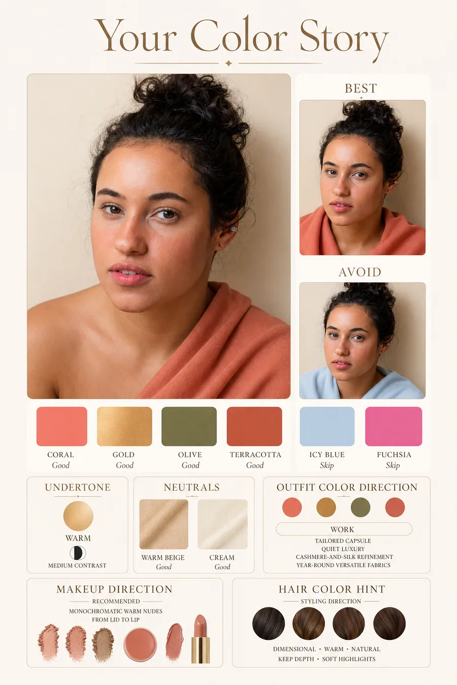
Color analysis is a styling method that compares your natural coloring with clothing, makeup, and hair colors. The goal is practical: find colors that make your face look clearer, more even, and easier to style.
The method is useful, but it is not magic. It works best when it looks at undertone, contrast, depth, and color intensity together. It works poorly when it turns one clue, like dark hair or fair skin, into a fixed rule.
The simple definition
Color analysis sorts colors by how they interact with your skin, eyes, hair, and facial contrast. A good result gives you best colors, useful neutrals, colors to handle carefully, and styling notes for makeup or hair.
Most modern systems use seasonal language. Spring and autumn usually lean warmer. Summer and winter usually lean cooler. The 12-season version adds more detail, such as light summer, bright spring, soft autumn, and deep winter.
The four clues that matter
Undertone asks whether colors with warm yellow, golden, or peach notes sit better than cool blue, pink, or violet notes. Value asks whether light, medium, or deep colors are easiest near your face. Chroma asks whether clear bright colors or softer muted colors look more natural. Contrast asks how much difference there is between your skin, hair, and eyes.
No single clue should decide the whole result. Gold jewelry looking good does not automatically make someone autumn. Dark hair does not automatically make someone winter. A reliable read compares several clues at once.
- Warm plus bright often points toward spring.
- Cool plus soft often points toward summer.
- Warm plus muted often points toward autumn.
- Cool plus clear often points toward winter.
What color analysis gets wrong
Color analysis gets shaky when it treats skin depth as a shortcut. Any skin tone can sit in any season family. It also gets shaky when the photo is poor, the hair is dyed far from its natural range, makeup changes the skin read, or the system assumes every person fits neatly into one label.
The most useful result is not a personality type. It is a shopping and styling tool. If the palette helps you choose a better white, a better lipstick, a better navy, or a safer hair color, it is doing its job.
Color analysis methods compared
Color analysis can happen through professional draping, an at-home kit, a quiz, an app, AI photo analysis, or a prompt workflow. These methods are not interchangeable. They trade off cost, speed, privacy, convenience, and confidence.
Professional draping compares real fabric near your face in controlled light. A kit gives you physical colors but leaves interpretation to you. A quiz teaches the vocabulary but depends on self-reporting. AI photo analysis is fast and visual, but lighting and camera processing matter. A prompt is best for organizing an already-likely result.
- Highest confidence: professional draping with controlled light and many fabric comparisons.
- Best tactile DIY option: a kit or real clothing test in indirect daylight.
- Fastest orientation: quiz or free preview.
- Best practical bridge: photo-based analysis that also gives outfits, makeup, and hair guidance.
- Weakest evidence: a season label based only on hair color, eye color, or one hex code.
How to know whether the result is useful
A useful color analysis result changes daily decisions. It helps you choose a white, a dark neutral, a denim wash, a lipstick, a metal, a hair direction, and a few colors to avoid near your face. If the result is only a label, it is incomplete.
The result should also survive testing. If a palette only works in one selfie but fails in daylight with real clothing, the evidence is weak. If several suggested colors make your skin look more even, your eyes clearer, and your outfits easier to combine, the result is doing useful work.
- Good result: best colors, neutrals, avoid colors, makeup, hair, and verification steps.
- Weak result: one fixed season with no uncertainty or practical examples.
- Good caveat: mentions lighting, camera, makeup, dyed hair, and adjacent seasons.
- Bad caveat: claims every person with one feature belongs to one season.
What Is Color Analysis? evidence checklist
What Is Color Analysis? should be judged by repeated evidence, not by one attractive swatch, one selfie, or one quiz answer. The strongest signal is consistency: the same color direction should make the face look clearer in daylight, make makeup easier, and make outfits feel more coherent.
Use this page with related guides such as AI color analysis, seasonal color analysis, color analysis quiz, free color analysis. Cross-linking the evidence matters because color analysis is not just one category. A palette affects wardrobe neutrals, lipstick, hair color, metals, denim, and how much contrast an outfit can carry near the face.
For this topic, start with the practical test that matches the search intent: compare methods, check privacy and photo quality, then verify the result with real clothing, lipstick, jewelry, or consultant questions.
- Run the test in indirect daylight rather than warm bathroom light or golden hour.
- Remove strong lipstick, bronzer, filters, and saturated clothing when judging undertone.
- Compare neighboring possibilities directly instead of asking whether one label feels perfect.
- Keep notes on skin clarity, eye brightness, shadow, redness, and whether the color or your face gets attention.
- Use StyleCard as a photo-based preview, then keep only the guidance that survives real-world checks.
What Is Color Analysis? practical next steps
After reading a guide like this, the next step should be small and testable. Do not replace a wardrobe, book a major salon change, or buy several products because one label sounded right. Start with one near-face color, one neutral, one metal, and one makeup cue.
If you are comparing tools, begin with the lowest-risk method that gives useful evidence. A free preview or quiz can narrow the field; a kit or consultant can resolve close calls; a paid report is most useful when it adds practical shopping, makeup, hair, and outfit guidance.
The most trustworthy result is flexible but not vague. It should say what to try, what to avoid, why the result might be uncertain, and how to confirm it. That is especially important for olive undertones, neutral coloring, deeper skin, dyed hair, gray hair, very muted palettes, and high-contrast palettes. If a recommendation cannot explain the tradeoff it is making, test again before spending money. A result should make repeat decisions easier, not just add a label.
- First purchase to test: one top, scarf, or lipstick in the likely palette.
- First closet move: move best colors near the face and weaker colors below the waist.
- First beauty move: test blush or lipstick before changing foundation or hair.
- First hair move: ask for a gloss, toner, or small shift before a dramatic multi-level change.
- First verification move: retake a clean photo and compare the result against real fabric.
- Final check: the guidance should improve at least three real choices, such as a neutral, a lip color, and a face-framing outfit.
How to use your result
Start with colors near your face: tops, scarves, jackets, earrings, glasses, lipstick, and hair color. Pants and shoes can be less exact because they sit farther from your face. If your palette says black is harsh, you may still wear black trousers and use a better color up top.
StyleCard turns the analysis into a usable set of cards. The free preview gives you a direction from a selfie and quiz. The full $9.99 pack adds color, outfit, makeup, hair, and overview cards so the result is easier to use while shopping.
Try it on your photo
Find your style direction from a selfie
Upload a natural-light selfie and get a free StyleCard preview before you buy a palette, makeup, or hair color.
Find your style direction from a selfieRelated StyleCard guides
FAQ
- What is the point of color analysis?
- The point is to make styling decisions easier. A useful result helps you choose clothing colors, makeup shades, hair color direction, and neutrals that work better near your face.
- Is color analysis the same as skin tone matching?
- No. Skin tone matters, but color analysis also looks at undertone, contrast, hair, eyes, depth, and color intensity.
- Can color analysis be wrong?
- Yes. Results can be wrong when the photo is poor, the questions are too simple, or one feature is over-weighted. Treat the result as a direction to test, not a permanent label.
Sources
About the StyleCard Team
Our guides are written using established color analysis frameworks — including the seasonal color system and Munsell color theory — reviewed against practitioner and academic sources, and updated when research or product changes warrant a revision. See the Sources section above for the references used in this article.