
makeup colors for your season
Makeup Colors for Your Season
By the StyleCard Team · Last updated June 27, 2026
Use seasonal color analysis to choose blush, lipstick, eye color, and finish without treating your season as a strict makeup rulebook.
Short answer
Cool seasons usually suit blue-based pinks, berries, roses, mauves, plums, and cooler browns. Warm seasons usually suit peach, coral, apricot, terracotta, bronze, warm brown, and golden neutrals. Soft seasons need lower intensity; bright seasons can handle clearer color.
Makeup is often where color analysis becomes useful fastest. A better lipstick, blush, bronzer, or eyeliner can change how your whole face reads before you buy new clothes.
The trick is to use your season as a direction, not a cage. Your face, contrast, skin depth, makeup style, and comfort level still matter.
Start with blush and lipstick
Blush and lipstick sit closest to the natural color in your face, so they expose a wrong undertone quickly. If a lipstick makes your teeth look yellow or your skin look gray, the temperature or intensity may be wrong.
Summer usually does well with dusty rose, mauve, soft berry, and cool pink. Winter can handle blue-red, clear berry, plum, and sharper rose. Spring often suits coral, peach, poppy, and warm pink. Autumn often suits terracotta, brick, warm rose, cinnamon, and muted peach.
Match foundation and metals to your undertone first
Before the fun shades, get the base right. Foundation should match your undertone, not just your depth. Warm skin usually needs a yellow-to-golden base, cool skin a pink-to-neutral base, and neutral or olive skin a balanced base that pulls neither pink nor orange. The wrong undertone is why a foundation that matches your depth can still sit on the skin like a mask.
Metals follow the same logic and double as a quick gut check: warm seasons usually look richer in gold and bronze, while cool seasons look cleaner in silver. Finish matters too. Soft, muted palettes read most natural in satin or skin-like finishes; bright palettes can carry a cleaner, fresher finish and a touch more shimmer.
- Warm skin: yellow-to-golden foundation base, gold metals
- Cool skin: pink-to-neutral base, silver metals
- Neutral or olive: balanced base, no strong pink or orange pull
- Match foundation along the jaw in daylight, then blend into the neck
Makeup direction by season
Use your season to choose the temperature and intensity of makeup, then adapt for skin depth and style. Spring usually needs warmth and clarity, Summer coolness and softness, Autumn warmth and earthiness, and Winter coolness with more contrast.
Finish changes the result as much as color. A shiny coral balm can look fresh on Spring but separate on Autumn. A velvety terracotta can look rich on Autumn but heavy on Light Spring. A blue-red matte can look polished on Winter and overpowering on Summer.
- Spring: peach, coral, warm pink, watermelon, fresh gloss, golden shimmer, brown or navy liner.
- Summer: dusty rose, mauve, cool pink, soft berry, satin or soft matte, taupe, slate, charcoal, and soft navy liner.
- Autumn: terracotta, brick, cinnamon, apricot, bronze, olive brown, cream or velvet matte, and warm brown liner.
- Winter: blue-red, cherry, fuchsia, plum, cool rose, black or charcoal liner, crisp matte or high shine.
- Neutral or olive: stay near the middle first, then test whether warmth, coolness, brightness, or softness is the missing variable.
One-product testing checklist
If you are unsure of your season, do not replace your full makeup bag. Test one product family at a time in daylight. Lipstick and blush are easiest because they sit close to natural face color and reveal undertone quickly.
Choose two opposite options: peach vs rose blush, coral vs berry lip, bronze vs taupe shadow, black vs charcoal liner. The better shade should make the rest of the face look calmer and more intentional. The worse shade often makes the makeup look pasted on, even if the color is beautiful by itself.
- First swap: lipstick or blush.
- Second swap: bronzer, contour, or highlighter temperature.
- Third swap: liner depth and softness.
- Final check: foundation undertone at the jaw in daylight.
- Keep what works; color analysis should reduce waste, not force a full reset.
Eyes and complexion need softer rules
Eyeshadow, liner, bronzer, and highlighter depend on your face shape, eye color, skin depth, and makeup style. A season can guide the temperature, but it should not force everyone into the same product list.
If your palette is soft, try diffused liner and lower-contrast shadows. If it is bright, cleaner contrast may work better. If it is deep, a little more depth near the lash line can balance the face.
Common makeup mistakes by palette
Cool palettes often struggle with orange bronzer, yellow beige concealer, and warm brown lipstick. Warm palettes often struggle with icy pink, blue-red, gray contour, and silver shimmer. Soft palettes can look overwhelmed by neon color. Bright palettes can look tired in dusty makeup.
You do not need to throw everything away. Start by changing one product: lip color, blush, or bronzer. That is usually enough to see whether the direction is right.
Makeup Colors for Your Season evidence checklist
Makeup Colors for Your Season should be judged by repeated evidence, not by one attractive swatch, one selfie, or one quiz answer. The strongest signal is consistency: the same color direction should make the face look clearer in daylight, make makeup easier, and make outfits feel more coherent.
Use this page with related guides such as skin color analysis, hair color analysis, lipstick colors by season, seasonal color analysis. Cross-linking the evidence matters because color analysis is not just one category. A palette affects wardrobe neutrals, lipstick, hair color, metals, denim, and how much contrast an outfit can carry near the face.
For this topic, start with the practical test that matches the search intent: compare methods, check privacy and photo quality, then verify the result with real clothing, lipstick, jewelry, or consultant questions.
- Run the test in indirect daylight rather than warm bathroom light or golden hour.
- Remove strong lipstick, bronzer, filters, and saturated clothing when judging undertone.
- Compare neighboring possibilities directly instead of asking whether one label feels perfect.
- Keep notes on skin clarity, eye brightness, shadow, redness, and whether the color or your face gets attention.
- Use StyleCard as a photo-based preview, then keep only the guidance that survives real-world checks.
Makeup Colors for Your Season practical next steps
After reading a guide like this, the next step should be small and testable. Do not replace a wardrobe, book a major salon change, or buy several products because one label sounded right. Start with one near-face color, one neutral, one metal, and one makeup cue.
If you are comparing tools, begin with the lowest-risk method that gives useful evidence. A free preview or quiz can narrow the field; a kit or consultant can resolve close calls; a paid report is most useful when it adds practical shopping, makeup, hair, and outfit guidance.
The most trustworthy result is flexible but not vague. It should say what to try, what to avoid, why the result might be uncertain, and how to confirm it. That is especially important for olive undertones, neutral coloring, deeper skin, dyed hair, gray hair, very muted palettes, and high-contrast palettes. If a recommendation cannot explain the tradeoff it is making, test again before spending money. A result should make repeat decisions easier, not just add a label.
- First purchase to test: one top, scarf, or lipstick in the likely palette.
- First closet move: move best colors near the face and weaker colors below the waist.
- First beauty move: test blush or lipstick before changing foundation or hair.
- First hair move: ask for a gloss, toner, or small shift before a dramatic multi-level change.
- First verification move: retake a clean photo and compare the result against real fabric.
- Final check: the guidance should improve at least three real choices, such as a neutral, a lip color, and a face-framing outfit.
How StyleCard turns this into a card
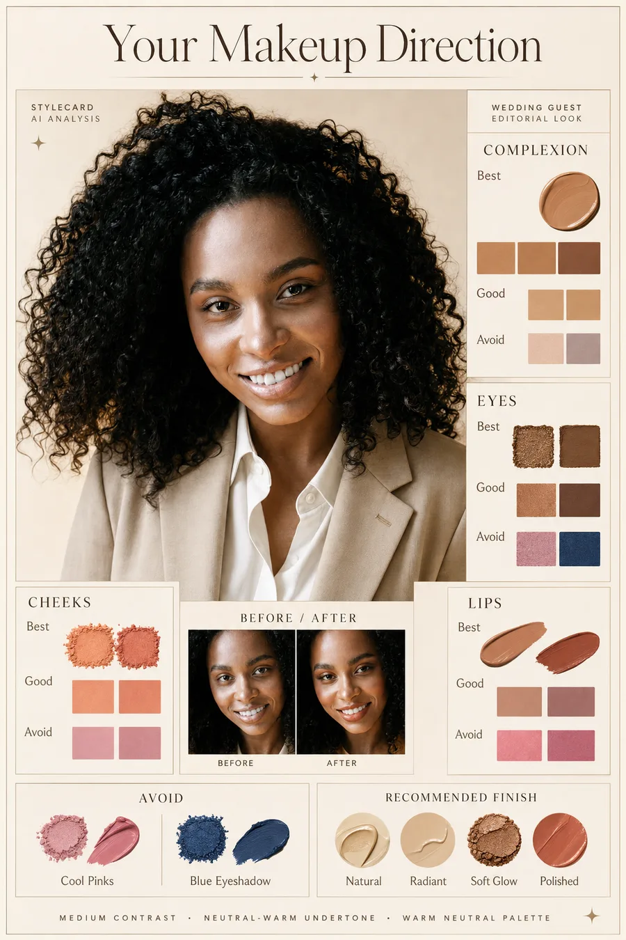
The full Style Card Pack includes a makeup direction card with complexion, eyes, cheeks, lips, and avoid shades. It is based on your selfie and quiz answers, so it can account for whether you want natural makeup, polished everyday makeup, or a stronger look.
That is more useful than a generic season chart because makeup has to sit on your actual face.
Try it on your photo
Get makeup colors in your StyleCard
Start with a free preview. Upgrade to the $9.99 pack when you want the makeup direction card.
Get makeup colors in your StyleCardRelated StyleCard guides
FAQ
- Should my makeup match my color season?
- It should harmonize with your season, but it does not need to be rigid. Use the season to choose undertone and intensity, then adapt for your skin depth and makeup style.
- What makeup should I change first?
- Start with lipstick or blush. Those shades sit closest to your natural face color and quickly show whether the undertone is helping.
- Can StyleCard recommend makeup colors?
- Yes. The full Style Card Pack includes makeup direction for complexion, eyes, cheeks, lips, and shades to use carefully.
- How do I choose foundation for my season?
- Match the undertone, not just the depth. Warm seasons usually need a yellow-to-golden base, cool seasons a pink-to-neutral base, and neutral or olive skin a balanced base. Test along the jaw in daylight and check that it blends into the neck.
- Can warm and cool seasons share any makeup?
- Some neutral shades work across temperatures, like a balanced rose or a soft brown. But blue-based and orange-based products rarely swap cleanly, so undertone is still the first thing to match.
Sources
About the StyleCard Team
Our guides are written using established color analysis frameworks — including the seasonal color system and Munsell color theory — reviewed against practitioner and academic sources, and updated when research or product changes warrant a revision. See the Sources section above for the references used in this article.