
soft autumn color palette
Soft Autumn Color Palette
By the StyleCard Team · Last updated June 14, 2026
See soft autumn colors, makeup ideas, outfit combinations, and the seasons most often confused with soft autumn.
Short answer
Soft autumn is warm-neutral, muted, and low to medium contrast. Think olive, camel, taupe, muted teal, dusty peach, soft terracotta, and warm gray.
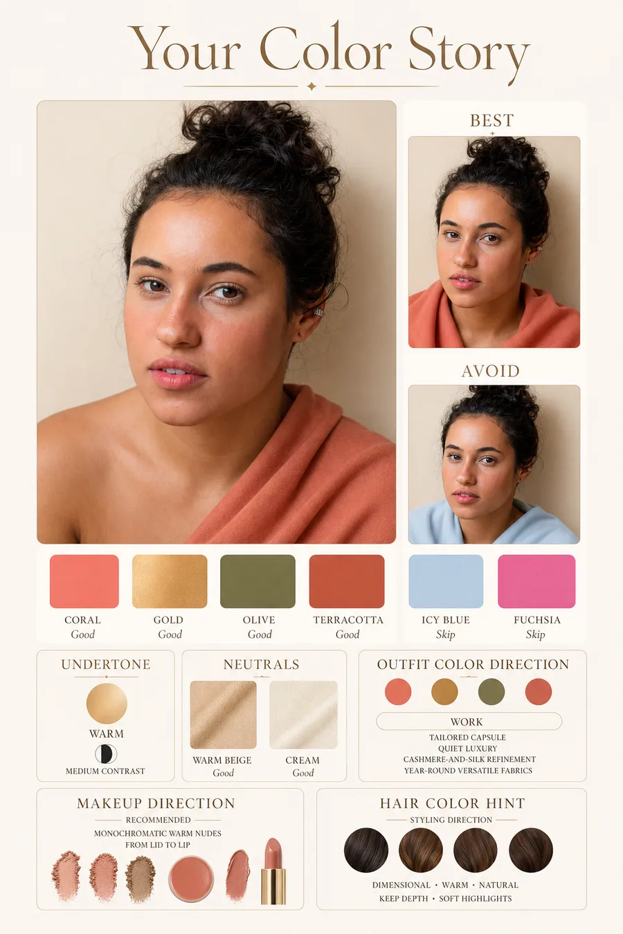
Soft autumn is warm, muted, and gentle. It sits between soft summer and true autumn, which is why many people who fit this palette look better in softened earth tones than in either cool pastels or strong orange-browns.
The easiest soft autumn test is contrast. If black, optic white, neon, and jewel tones make your face look tired, but olive, camel, mushroom, muted teal, and dusty peach look natural, soft autumn may be close.
Best soft autumn colors
Soft autumn colors are warm without being loud. Good colors often look slightly sun-faded or earthy: camel, olive, warm taupe, mushroom, muted teal, dusty peach, moss, soft rust, cocoa, and antique gold.
The palette can still have depth. Chocolate brown, muted navy, deep olive, and warm burgundy can work when they are softened rather than sharp.
Colors to use carefully
Pure black and stark white are usually too hard. Neon colors, icy pastels, and blue-based jewel tones can pull the eye to the clothes instead of the face.
If you love black, move it away from the face or soften it with texture, sheer fabric, warm makeup, or soft autumn accessories.
Palette preview
Colors to test near your face
- Undertone
- Warm-neutral
- Chroma
- Muted and dusty
- Value
- Light-medium to medium-deep
- Contrast
- Low to medium
Best colors
Olive
#7A7B4E
Muted teal
#4F7C75
Dusty peach
#D69A7E
Terracotta
#B86F52
Neutrals
Camel
#B18A5E
Mushroom
#9A8B78
Makeup cues
Earth rose
#B97970
Warm taupe eye
#8B715E
Use carefully
Optic white
#FFFFFF
Neon pink
#FF2DAA
Outfit starting points
- Olive jacket, cream tee, mushroom trousers, aged brass jewelry.
- Camel sweater, muted teal skirt, warm taupe boots.
- Dusty peach blouse, soft brown denim, terracotta lip stain.
Makeup palette
Soft autumn makeup tends to look best in earth rose, sandstone, peach beige, muted coral, warm taupe, olive brown, soft bronze, and terracotta. Heavy black liner can look disconnected. Brown, olive, or smoky taupe is usually easier.
Lips often work in muted peach, rosewood, cinnamon, soft brick, and warm nude. Very cool pink or glossy fuchsia can look separate from the rest of the face.
Soft Autumn Color Palette clothing checkpoints
Soft Autumn Color Palette works best when clothing follows the same undertone, value, chroma, and contrast as the palette. Start with the reliable anchors: Camel, Mushroom. Then use face-framing accents from the best-color range: Olive, Muted teal, Dusty peach, Terracotta.
Keep the strictest colors near your face. Tops, jackets, scarves, earrings, glasses, and lipstick affect skin and eye clarity most. Pants, shoes, and bags can be more flexible, but the outfit should still read as one color story instead of several competing palettes.
Use caution with Optic white, Neon pink. Those colors are not banned, but they usually work better away from the face or balanced with stronger palette colors above the waist.
- Best accents to test: Olive, Muted teal, Dusty peach, Terracotta.
- Best neutrals to build around: Camel, Mushroom.
- Makeup cues to compare: Earth rose, Warm taupe eye.
- Avoid buying a full capsule until three near-face colors work in daylight.
- If black, white, beige, denim, or gold feels off, adjust those basics before replacing statement pieces.
Soft Autumn Color Palette verification loop
Verify Soft Autumn Color Palette with paired comparisons, not isolated swatches. Hold one likely best color near your face, then hold the nearest wrong color. You are looking for changes in skin evenness, under-eye shadows, redness, jaw definition, and whether your eyes look clearer.
Then test a real outfit and a real makeup cue. A palette should survive practical use: a top you would wear, a neutral you can build around, a lipstick or blush family, a metal, and a denim or shoe color. If the palette only looks good as a digital swatch, keep testing.
Neighboring seasons are the hardest part. If the result feels close, compare the sister palette directly rather than asking whether every color is perfect. Seasonal analysis is strongest when it explains which tradeoff is easier: warmer or cooler, softer or brighter, lighter or deeper.
- Daylight test: one best color, one avoid color, and one neutral from the palette.
- Makeup test: compare Earth rose, Warm taupe eye against an opposite undertone.
- Wardrobe test: build one outfit from Olive jacket, cream tee, mushroom trousers, aged brass jewelry..
- Photo test: retake in neutral light if the result depends on one selfie.
- Shopping rule: buy slowly, keep useful off-palette pieces away from the face, and replace basics first.
Soft Autumn Color Palette evidence checklist
Soft Autumn Color Palette should be judged by repeated evidence, not by one attractive swatch, one selfie, or one quiz answer. The strongest signal is consistency: the same color direction should make the face look clearer in daylight, make makeup easier, and make outfits feel more coherent.
Use this page with related guides such as seasonal color analysis, autumn color palette, warm autumn color palette, deep autumn color palette. Cross-linking the evidence matters because color analysis is not just one category. A palette affects wardrobe neutrals, lipstick, hair color, metals, denim, and how much contrast an outfit can carry near the face.
For this palette, start by testing Olive, Muted teal, Dusty peach, Terracotta. Then compare those colors with the caution colors, especially Optic white, Neon pink. The goal is not to love every recommended color equally; it is to see whether the palette's temperature, value, and chroma repeatedly help your face.
- Run the test in indirect daylight rather than warm bathroom light or golden hour.
- Remove strong lipstick, bronzer, filters, and saturated clothing when judging undertone.
- Compare neighboring possibilities directly instead of asking whether one label feels perfect.
- Keep notes on skin clarity, eye brightness, shadow, redness, and whether the color or your face gets attention.
- Use StyleCard as a photo-based preview, then keep only the guidance that survives real-world checks.
Soft Autumn Color Palette practical next steps
After reading a guide like this, the next step should be small and testable. Do not replace a wardrobe, book a major salon change, or buy several products because one label sounded right. Start with one near-face color, one neutral, one metal, and one makeup cue.
If you want a clothing test, begin with a simple outfit formula such as: Olive jacket, cream tee, mushroom trousers, aged brass jewelry.. Then swap only one variable at a time. Change the neutral, the lipstick, the metal, or the contrast level so you can see what actually improves the look.
The most trustworthy result is flexible but not vague. It should say what to try, what to avoid, why the result might be uncertain, and how to confirm it. That is especially important for olive undertones, neutral coloring, deeper skin, dyed hair, gray hair, very muted palettes, and high-contrast palettes. If a recommendation cannot explain the tradeoff it is making, test again before spending money. A result should make repeat decisions easier, not just add a label.
- First purchase to test: one top, scarf, or lipstick in the likely palette.
- First closet move: move best colors near the face and weaker colors below the waist.
- First beauty move: test blush or lipstick before changing foundation or hair.
- First hair move: ask for a gloss, toner, or small shift before a dramatic multi-level change.
- First verification move: retake a clean photo and compare the result against real fabric.
- Final check: the guidance should improve at least three real choices, such as a neutral, a lip color, and a face-framing outfit.
Similar seasons
Soft autumn is often confused with soft summer and true autumn. Soft summer is cooler and usually better in mauve, slate, and rose-gray. True autumn is warmer and richer, with more tolerance for golden orange, mustard, and strong rust.
If both soft summer and soft autumn partly work, compare metals and greens. Soft autumn usually handles antique gold, olive, and camel better. Soft summer usually handles silver, rose, and blue-gray better.
Try it on your photo
Confirm your palette with StyleCard
A soft autumn result should work on your face, not stop at a swatch chart. Check it with a free StyleCard preview.
Confirm your palette with StyleCardRelated StyleCard guides
FAQ
- What colors should soft autumn avoid?
- Soft autumn usually struggles with optic white, pure black, neon colors, icy pastels, and very cool jewel tones.
- Can soft autumn wear navy?
- Muted navy, teal navy, or softened deep blue can work. A very crisp dark navy may look too cool or formal near the face.
- Is soft autumn warm or cool?
- Soft autumn is warm-neutral. It has warmth, but the stronger trait is softness, so overly hot orange or bright gold can still be too much.
Sources
About the StyleCard Team
Our guides are written using established color analysis frameworks — including the seasonal color system and Munsell color theory — reviewed against practitioner and academic sources, and updated when research or product changes warrant a revision. See the Sources section above for the references used in this article.