
skin color analysis
Skin Color Analysis
By the StyleCard Team · Last updated July 3, 2026
Learn how skin undertone fits into color analysis, why skin tone alone is not enough, and how to use a selfie for better color direction.
Short answer
Skin color analysis should look at undertone plus contrast and color intensity. Skin depth alone does not determine your season, and any skin tone can belong to any seasonal family.
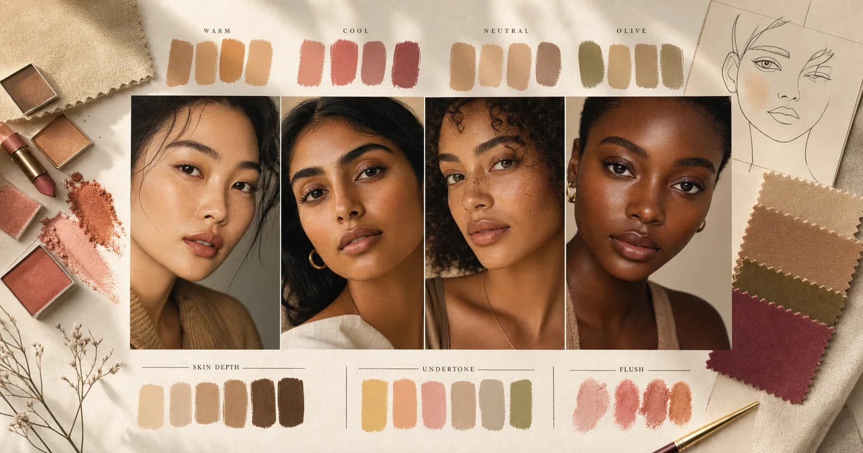
Skin color analysis usually means undertone analysis, but undertone is only one part of the picture. Your best colors also depend on contrast, hair, eyes, depth, and whether your features look clearer in soft or bright colors.
This matters because many quick tests overpromise. Veins, jewelry, and foundation shade can help, but none of them can reliably type every person by themselves.
Undertone is useful, but incomplete
Undertone asks whether warm, cool, or neutral colors sit more naturally against your skin. Warm undertones often handle golden, peach, camel, olive, and brick better. Cool undertones often handle rose, blue, lavender, plum, and cool gray better.
Neutral and olive undertones can be harder. They may need careful testing because both warm and cool colors can partly work while only certain versions feel right.
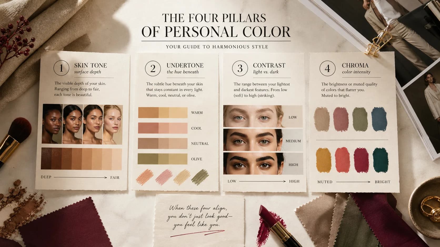
Skin tone, undertone, overtone, contrast, and chroma are separate ideas. Skin tone is depth, such as fair, medium, tan, deep, or rich. Undertone is the stable color cast underneath. Overtone is the temporary surface look from redness, tanning, flushing, or foundation. Contrast is the light-dark relationship between skin, hair, and eyes. Chroma is whether your coloring looks clearer or more muted.
- Skin tone: depth or shade of skin.
- Undertone: warm, cool, neutral, or olive color direction.
- Overtone: temporary surface color from redness, tan, makeup, or lighting.
- Contrast: how much light-dark separation your features have.
- Chroma: whether bright or muted colors harmonize better.
Quick at-home undertone tests (and their limits)
Three tests give a fast read. The vein test: in natural light, mostly blue or purple veins lean cool, mostly green veins lean warm, a mix reads neutral, and a blue-green or teal mix with bronze-green skin often signals olive. The jewelry test: if silver flatters more than gold you usually lean cool, gold over silver leans warm, and both working points to neutral or olive. The white-versus-cream test: hold pure white near your face, and if cream looks kinder while pure white looks harsh, you likely lean warm.
Treat these as hints, not verdicts. Lighting, a recent tan, foundation, and even a colored shirt can flip a result, and olive skin in particular confuses every one of them. That is why a full reading also weighs contrast, depth, hair, and eyes instead of resting on a single test.
- Veins blue/purple = cool, green = warm, teal/mixed = neutral or olive
- Silver over gold = cool; gold over silver = warm; both = neutral/olive
- Cream kinder than pure white = warmer undertone
- Run tests in daylight, makeup off, with a neutral background
Undertone tests and why they conflict
The vein, jewelry, white-paper, and sun-reaction tests are popular because they are quick. They are also incomplete. Veins can look blue and green in the same arm. Gold and silver can both work on neutral or olive skin. White paper can be too bright, too blue, or distorted by indoor light. Sun reaction says more about melanin response and sunscreen habits than seasonal color.
Use the tests as a group. If every test points cool and cool drapes also look better, the signal is useful. If the tests disagree, stop forcing a label and compare actual colors: magenta vs peach, camel vs charcoal, cream vs optic white, olive vs pine, dusty rose vs orange, and soft navy vs black.
- Vein test limitation: skin depth, lighting, and olive undertone can make blue-green readings ambiguous.
- Jewelry test limitation: personal taste, metal finish, and neutral undertone can make both metals acceptable.
- White-paper test limitation: optical brighteners, shadows, and artificial lighting can exaggerate yellow or gray casts.
- Sun test limitation: burning and tanning are not reliable season labels.
- Best correction: test paired colors near the face in indirect daylight and look for skin clarity, not fabric preference.
Why skin tone alone is not enough
Two people can have similar skin depth and need very different colors. One may look best in soft summer shades. Another may need bright spring clarity. Another may need winter contrast. The difference comes from undertone, chroma, contrast, and the relationship between skin, hair, and eyes.
A good system should avoid shortcuts such as deeper skin equals autumn or winter, or fair skin equals spring or summer. Those shortcuts are wrong often enough to be harmful.
Melanin affects depth, but depth is not the same as seasonal warmth. A person with deep skin can still be cool, bright, soft, or light in the seasonal sense. A person with fair skin can still be warm, muted, deep, or olive. The analysis has to compare multiple axes instead of treating ethnicity or skin depth as the answer.
Olive undertone and mixed signals
Olive undertone often shows up as a subtle green, gray-green, or yellow-green cast. It can be pale, medium, or deep. Many olive people get contradictory results because the vein test looks blue-green, both silver and gold can partly work, and standard foundation looks too pink, too orange, or too yellow.
Olive is not automatically warm. Some olive coloring is warm and earthy. Some is cool-neutral and muted. Some needs clear contrast. The best check is still how colors behave near the face: mustard, orange, icy pink, dusty mauve, teal, pine, camel, and charcoal will reveal more than one vein test.
- If both metals work, compare bright gold, antique gold, bright silver, and brushed silver.
- If foundation always looks pink or orange, test whether muted olive, teal, mauve, or soft rose-beige sits better.
- If every quick test conflicts, treat neutral or olive as a possibility and verify with drapes or a photo-based preview.
Skin depth, melanin, and season are separate
Skin depth describes how light or deep the surface skin appears. Undertone describes whether the color direction underneath reads warmer, cooler, neutral, or olive. Seasonal analysis then adds value, chroma, and contrast. Those are different axes, and mixing them up is where many old shortcuts fail.
A person with deep skin can still need Spring clarity, Summer softness, Autumn warmth, or Winter contrast. A person with fair skin can still be muted, warm, deep, or olive. The correct question is not what demographic category someone fits; it is which colors make the face look more even, dimensional, and alive.
- Fair skin does not automatically mean Spring or Summer.
- Deep skin does not automatically mean Autumn or Winter.
- Olive skin can be warm, cool, neutral, muted, bright, fair, medium, or deep.
- Dyed hair and makeup can change perceived contrast without changing undertone.
- A trustworthy result separates surface depth from hue, contrast, and chroma.
How to test colors near your face
Use natural light and remove strong makeup if you can. Compare two colors at a time: cream vs optic white, camel vs cool taupe, coral vs blue-pink, olive vs pine, chocolate vs charcoal. Look at your face, not the fabric.
The better color usually makes shadows look softer, redness less distracting, and the eyes clearer. The worse color can make the skin look yellow, gray, blotchy, or tired.
Photos add another layer of risk. Warm indoor light can make everyone look golden. Fluorescent light can make skin look green. Beauty filters can smooth away contrast. Dyed hair and heavy makeup can dominate the read. If you use an app or AI color analysis, start with the cleanest possible photo and then verify the result against real clothes.
Photo accuracy checklist for skin analysis
Photo-based skin color analysis needs the same discipline as draping. Use indirect daylight, remove strong makeup, avoid colored walls and bright shirts, and keep the camera from adding warmth or smoothing. If your device uses display features that shift color, do not judge the final palette only on that screen.
Then verify in the real world. Compare cream and optic white, camel and charcoal, coral and blue-pink, olive and pine, and dusty rose and orange near your face. You are looking for repeated skin clarity, not a single trick test.
- Best input: bare or light makeup, natural light, neutral background, no filter.
- Risky input: warm bulbs, golden hour, self-tanner, foundation, beauty mode, colored shirt.
- Check depth separately from undertone.
- Check undertone separately from contrast and chroma.
- Use StyleCard or draping when olive, neutral, or mixed signals make quick tests conflict.
Skin Color Analysis evidence checklist
Skin Color Analysis should be judged by repeated evidence, not by one attractive swatch, one selfie, or one quiz answer. The strongest signal is consistency: the same color direction should make the face look clearer in daylight, make makeup easier, and make outfits feel more coherent.
Use this page with related guides such as what is color analysis, makeup colors for your season, lipstick colors by season, hair color analysis. Cross-linking the evidence matters because color analysis is not just one category. A palette affects wardrobe neutrals, lipstick, hair color, metals, denim, and how much contrast an outfit can carry near the face.
For this topic, start with the practical test that matches the search intent: compare methods, check privacy and photo quality, then verify the result with real clothing, lipstick, jewelry, or consultant questions.
- Run the test in indirect daylight rather than warm bathroom light or golden hour.
- Remove strong lipstick, bronzer, filters, and saturated clothing when judging undertone.
- Compare neighboring possibilities directly instead of asking whether one label feels perfect.
- Keep notes on skin clarity, eye brightness, shadow, redness, and whether the color or your face gets attention.
- Use StyleCard as a photo-based preview, then keep only the guidance that survives real-world checks.
Skin Color Analysis practical next steps
After reading a guide like this, the next step should be small and testable. Do not replace a wardrobe, book a major salon change, or buy several products because one label sounded right. Start with one near-face color, one neutral, one metal, and one makeup cue.
If you are comparing tools, begin with the lowest-risk method that gives useful evidence. A free preview or quiz can narrow the field; a kit or consultant can resolve close calls; a paid report is most useful when it adds practical shopping, makeup, hair, and outfit guidance.
The most trustworthy result is flexible but not vague. It should say what to try, what to avoid, why the result might be uncertain, and how to confirm it. That is especially important for olive undertones, neutral coloring, deeper skin, dyed hair, gray hair, very muted palettes, and high-contrast palettes. If a recommendation cannot explain the tradeoff it is making, test again before spending money. A result should make repeat decisions easier, not just add a label.
- First purchase to test: one top, scarf, or lipstick in the likely palette.
- First closet move: move best colors near the face and weaker colors below the waist.
- First beauty move: test blush or lipstick before changing foundation or hair.
- First hair move: ask for a gloss, toner, or small shift before a dramatic multi-level change.
- First verification move: retake a clean photo and compare the result against real fabric.
- Final check: the guidance should improve at least three real choices, such as a neutral, a lip color, and a face-framing outfit.
Where StyleCard helps
StyleCard uses your selfie and quiz answers to give a practical direction instead of asking you to self-diagnose every undertone clue. The free preview lets you test whether the direction feels right before paying.
The full pack adds makeup and hair guidance, which is where skin analysis becomes more useful. Foundation, blush, lipstick, hair warmth, and clothing colors all affect each other.
Try it on your photo
Check your undertone with a photo
Use a natural-light selfie for a free StyleCard preview. Photos auto-delete after 24 hours.
Check your undertone with a photoRelated StyleCard guides
FAQ
- Is skin color analysis the same as color analysis?
- No. Skin undertone is one input. Full color analysis also considers contrast, hair, eyes, value, and chroma.
- Can deeper skin be spring or summer?
- Yes. Deeper skin can belong to any season. Seasonal analysis should not use skin depth as the only clue.
- What photo works best for skin color analysis?
- Use a recent front-facing photo in natural light with no heavy filter, colored lighting, sunglasses, or strong makeup.
- Is the vein test accurate for undertone?
- It is a useful hint, not a verdict. Lighting, tanning, and skin conditions can change vein color, and olive skin often reads as a confusing mix. Combine it with the jewelry and white-versus-cream tests.
- How do I read an olive undertone?
- Olive skin usually shows a blue-green or teal vein mix and a slight bronze-green cast, and it can wear both gold and silver. Olive often needs muted, slightly warm-neutral colors rather than very icy or very golden ones.
Sources
About the StyleCard Team
Our guides are written using established color analysis frameworks — including the seasonal color system and Munsell color theory — reviewed against practitioner and academic sources, and updated when research or product changes warrant a revision. See the Sources section above for the references used in this article.