color analysis kit
Color Analysis Kit
By the StyleCard Team · Last updated July 3, 2026
Compare color analysis kits with apps, AI photo tools, quizzes, ChatGPT prompts, and professional draping before you buy a swatch set.
Short answer
A color analysis kit is worth considering if you want physical swatches and at-home draping practice. Use an app or AI preview first if you want a faster, cheaper starting point before buying a kit or booking a consultant.
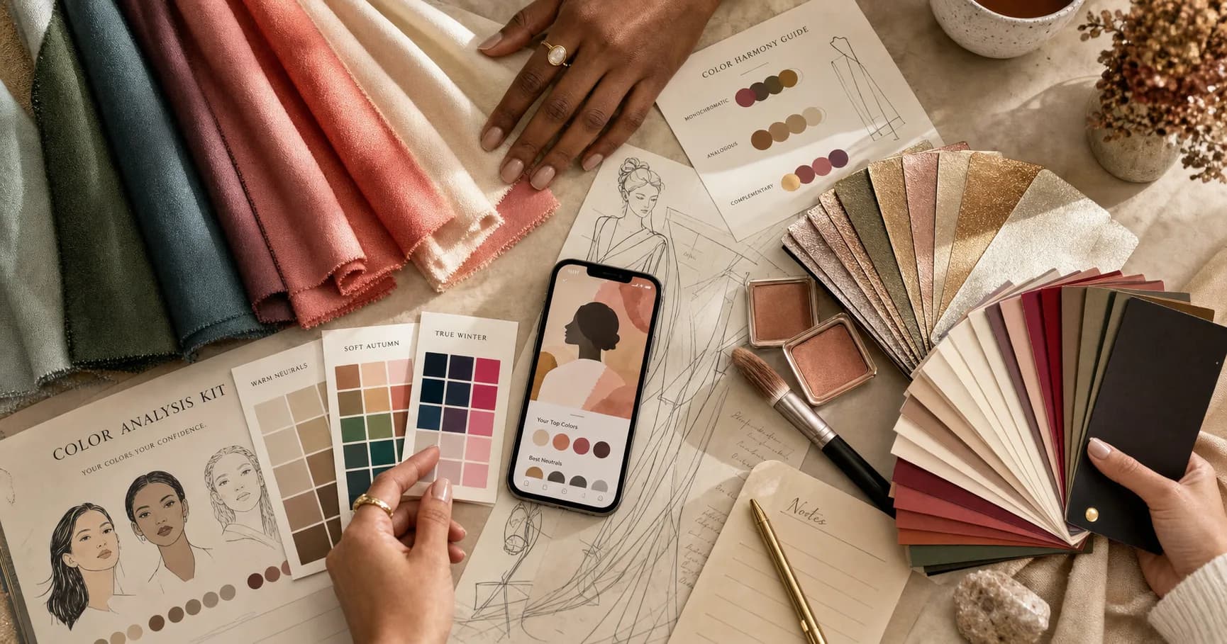
A color analysis kit gives you physical colors to hold near your face. Some kits use cardstock frames or cards. Better tactile kits use dyed fabric drapes, swatch fans, shopping cards, metallic tests, and rating sheets.
The appeal is obvious: you can see real color in real light instead of guessing from a screen. The risk is also obvious: home lighting, low-quality materials, and observer bias can make a kit feel more certain than it is.
What a color analysis kit includes
Entry kits often include about 28 to 36 cards or fabric pieces, while professional draping systems can include 120 to 155 or more drapes. A small kit can teach broad warm, cool, light, deep, soft, and bright reactions. A larger kit is better for separating neighboring sub-seasons.
Common extras include instructions, comparison sheets, shopping cards, lipstick or metal tests, and season summaries. Fabric is usually more useful than printed cards because it behaves more like clothing, but cardstock can still help with quick temperature and contrast checks.
- Card kits: portable, cheaper, easier to store, but less textile-realistic.
- Fabric drapes: better for clothing decisions, but quality and dye accuracy vary.
- Swatch fans: useful after you know your season, weaker for diagnosis.
- Professional kits: more nuanced, expensive, and usually designed for trained consultants.
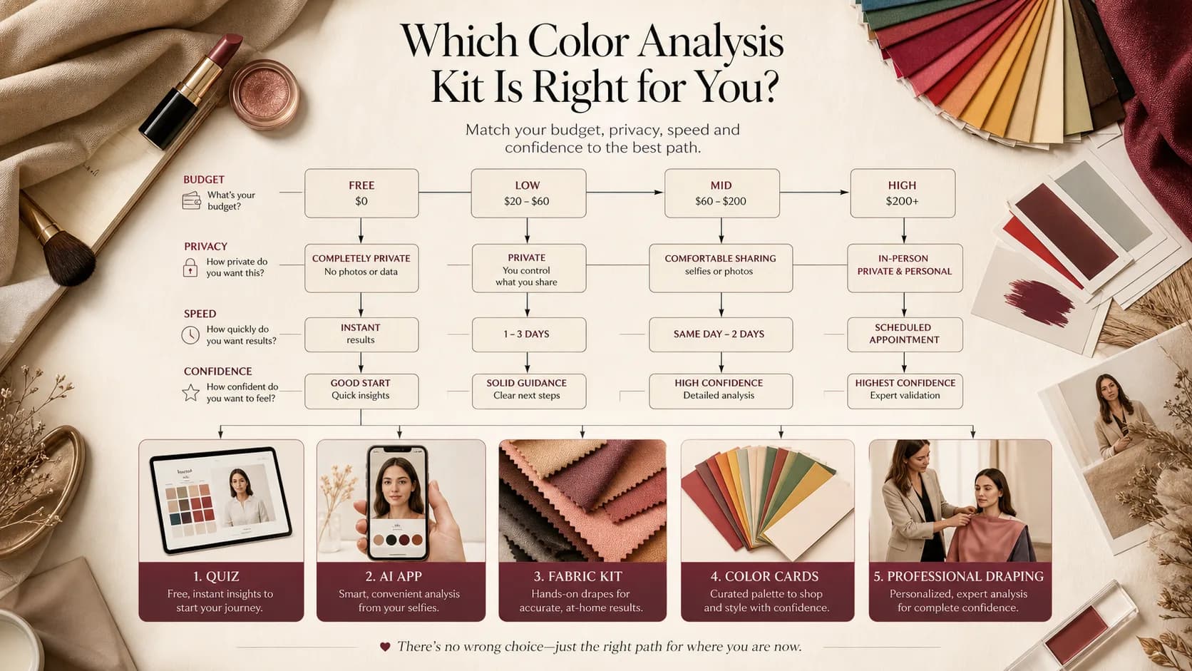
Kit vs app vs quiz vs AI vs consultant
A kit is not automatically more accurate than an app. It is more physical. Accuracy still depends on daylight, neutral surroundings, your ability to judge facial changes, and whether the kit has enough nuanced colors for your case.
A quiz is fastest and cheapest, but it depends on self-reporting. AI photo analysis is more personal, but photo quality matters. A kit protects more privacy because you do not need to upload a face photo. A trained consultant remains the highest-confidence option when the lighting, drapes, and interpretation are controlled.
- Best first pass: quiz or free AI preview.
- Best privacy-first self-test: physical kit in daylight.
- Best tactile learning: fabric drapes and swatches.
- Best high-stakes decision: professional draping.
- Best value before buying: use StyleCard to narrow the likely family, then test fewer kits or swatches.
Color analysis kit buying criteria
The best color analysis kit is not the biggest set by default. It is the set that gives you enough accurate comparisons for your use case. A four-season kit can teach broad warm/cool and soft/clear differences. A 12-season or professional kit is more useful when you already know you are between neighboring palettes.
Material quality matters because a weak dye or printed card can misrepresent the season. Fabric drapes usually behave more like real clothing than glossy cards. Cards are still useful for portability and quick shopping checks, but they should not be treated as a professional draping substitute.
- Look for: fabric or matte cards, clear instructions, neutral comparison colors, warm/cool tests, soft/bright tests, and rating sheets.
- Helpful extras: metallic tests, shopping cards, lipstick checks, neutral progression, and guidance for 12-season boundaries.
- Use caution: kits with only stereotypes, no muted colors, no deep or olive examples, or colors that look different from the printed guide.
- Best use case: tactile learners, privacy-first users, closet audits, and people who want physical swatches for shopping.
When not to use a kit as the final answer
Do not use a home kit as the final answer when the lighting is inconsistent, when the observer is strongly invested in one result, or when your coloring is subtle enough that several seasons partly work. Observer bias is real: people often choose the colors they like, the season they expected, or the colors that match their current wardrobe.
A kit can also struggle when the person has dyed hair, strong makeup habits, recent tanning, very neutral or olive undertone, or deep skin that older season examples do not represent well. In those cases, use the kit as one evidence source and compare it with a clean photo preview or a professional draping session.
- Use a kit for education and verification, not a guaranteed diagnosis.
- Retest on another day if the result depends on one close comparison.
- Use a consultant for weddings, major hair changes, professional branding, or expensive wardrobe purchases.
- Use StyleCard first when you want a faster shortlist before buying a large swatch system.
How to use a kit at home
Set up near a window in indirect daylight. Face the light, use a neutral background, remove heavy makeup, and cover bright clothing. Pull dyed hair back if it is far from your natural color so the drapes do not get judged against the dye.
Compare pairs instead of staring at one color. Try cream vs optic white, camel vs charcoal, coral vs blue-pink, rust vs plum, olive vs emerald, and soft navy vs black. Look at the face first: shadows, redness, eye clarity, and whether the color or the person gets attention.
- Retest on another daylight morning if the result feels close.
- Take notes on reactions instead of forcing a season immediately.
- Use lipstick and metal tests as supporting evidence, not the whole answer.
- Be cautious with cheap kits that skip muted, olive, deep, or neutral-cool edge cases.
Method comparison: kit, app, AI, quiz, and consultant
A kit wins on tactile evidence and privacy because you can hold color near your face without uploading anything. An app wins on convenience and saved output. AI wins on speed and personalization when the photo is clean. A quiz wins on education and zero friction. A consultant wins on controlled comparison and expert interpretation.
The right choice depends on the decision. For curiosity, start free. For a closet refresh, a photo preview or app can be enough. For a high-stakes wardrobe, wedding, branding shoot, or expensive hair change, professional draping may be worth the extra cost.
- Kit: physical color, private, reusable, but vulnerable to observer bias.
- App: convenient and saveable, but quality depends on method and photo instructions.
- AI photo: fast and personal, but lighting, makeup, and camera processing can distort results.
- Quiz: free and educational, but weak for subtle undertone and contrast cases.
- Consultant: highest confidence, highest cost, least immediate.
Decision tree for choosing a color analysis kit
Choose a basic kit if you want to learn broad seasonal differences and test clothes at home. Choose a larger kit if you already know the family but need to compare sub-seasons. Choose a consultant if your result is still ambiguous after several controlled tests.
Do not buy a kit expecting it to remove judgment. It gives you better color samples; it does not automatically interpret your face. You still need neutral light, a clean face, notes, retesting, and a willingness to accept that two neighboring palettes may both partly work.
- Lowest budget: free quiz plus closet drapes before buying anything.
- Privacy-first: physical kit or clothing tests instead of photo upload.
- Fastest route: StyleCard preview before investing in a kit.
- Most nuanced route: professional draping with many fabric comparisons.
- Best sequence: preview, shortlist, kit or consultant only if the decision still matters.
Color Analysis Kit evidence checklist
Color Analysis Kit should be judged by repeated evidence, not by one attractive swatch, one selfie, or one quiz answer. The strongest signal is consistency: the same color direction should make the face look clearer in daylight, make makeup easier, and make outfits feel more coherent.
Use this page with related guides such as best color analysis app, free color analysis, AI color analysis, color analysis quiz. Cross-linking the evidence matters because color analysis is not just one category. A palette affects wardrobe neutrals, lipstick, hair color, metals, denim, and how much contrast an outfit can carry near the face.
For this topic, start with the practical test that matches the search intent: compare methods, check privacy and photo quality, then verify the result with real clothing, lipstick, jewelry, or consultant questions.
- Run the test in indirect daylight rather than warm bathroom light or golden hour.
- Remove strong lipstick, bronzer, filters, and saturated clothing when judging undertone.
- Compare neighboring possibilities directly instead of asking whether one label feels perfect.
- Keep notes on skin clarity, eye brightness, shadow, redness, and whether the color or your face gets attention.
- Use StyleCard as a photo-based preview, then keep only the guidance that survives real-world checks.
Color Analysis Kit practical next steps
After reading a guide like this, the next step should be small and testable. Do not replace a wardrobe, book a major salon change, or buy several products because one label sounded right. Start with one near-face color, one neutral, one metal, and one makeup cue.
If you are comparing tools, begin with the lowest-risk method that gives useful evidence. A free preview or quiz can narrow the field; a kit or consultant can resolve close calls; a paid report is most useful when it adds practical shopping, makeup, hair, and outfit guidance.
The most trustworthy result is flexible but not vague. It should say what to try, what to avoid, why the result might be uncertain, and how to confirm it. That is especially important for olive undertones, neutral coloring, deeper skin, dyed hair, gray hair, very muted palettes, and high-contrast palettes. If a recommendation cannot explain the tradeoff it is making, test again before spending money. A result should make repeat decisions easier, not just add a label.
- First purchase to test: one top, scarf, or lipstick in the likely palette.
- First closet move: move best colors near the face and weaker colors below the waist.
- First beauty move: test blush or lipstick before changing foundation or hair.
- First hair move: ask for a gloss, toner, or small shift before a dramatic multi-level change.
- First verification move: retake a clean photo and compare the result against real fabric.
- Final check: the guidance should improve at least three real choices, such as a neutral, a lip color, and a face-framing outfit.
When StyleCard should come first
If you are not sure whether color analysis will help, start with a free StyleCard preview. It gives a photo-based direction before you spend on a physical kit, a swatch fan, or an in-person appointment.
That is especially useful when you already suspect two or three seasons. A photo preview can help you choose which drapes to test first, what makeup families to compare, and whether your real problem is temperature, contrast, or chroma.
Try it on your photo
Try StyleCard before buying a kit
Upload a natural-light selfie, see a free preview, and decide whether a physical kit is still worth the investment.
Try StyleCard before buying a kitRelated StyleCard guides
FAQ
- Is a color analysis kit worth it?
- It can be worth it if you want physical swatches and are willing to test carefully in daylight. It is less useful if the kit is low quality or you want someone else to interpret subtle reactions.
- Are fabric drapes better than color cards?
- Fabric usually behaves more like clothing, so it can be better for wardrobe decisions. Cards are cheaper and portable, but printed color can be less realistic.
- How much does a color analysis kit cost?
- Basic consumer kits often sit roughly in the $20 to $120 range. Professional draping systems can cost hundreds of dollars or more than $1,200 depending on size and quality.
- Is a kit more accurate than an app?
- Not automatically. A kit removes camera distortion but adds self-evaluation bias. An app is faster and more guided, but depends on photo quality.
- Do I still need a professional consultant?
- You may if the result affects a major wardrobe, wedding, hair, or branding decision. A kit or StyleCard preview is better as a lower-cost first pass.
Sources
About the StyleCard Team
Our guides are written using established color analysis frameworks — including the seasonal color system and Munsell color theory — reviewed against practitioner and academic sources, and updated when research or product changes warrant a revision. See the Sources section above for the references used in this article.